800-526-4677
Blue sky, green grass, yellow sun. Nearly everything in our world has some kind of color associated with it. We even have sayings that use colors in them. We say that someone is “green with envy,” “white as a sheet,” or “a yellow-bellied coward.” For painters, artists, interior designers, and marketers, the correct use of color is critical to the success of their business. But did you know that color can play an important role in the world of education, too?
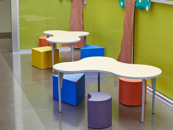
Most teachers agree that color makes a classroom come alive. Colorful school furniture and bright bulletin boards can transform a plain, dull room into a bright and exciting place, capable of holding children’s attention. Color can do more than liven up a room, though; the power of color is so strong that used incorrectly, colors can cause students to become excitable and hyperactive. It’s important to take the psychology of colors into account when deciding what colors to use and what colors to avoid when thinking about classroom design.
Numerous studies have been conducted over the years on the effects of color on a person’s psychology and physiology, and researchers agree that color definitely has both a mental and physical impact on a person. Certain colors tend to be more soothing, while others are considered stimulating. When applying this knowledge of psychology of colors to the classroom, one can see how critical it is to ensure that the classroom design achieves maximum results when trying to encourage children to learn.
In general, response to color on the warm side of the scale (reds, oranges, and yellows) tends to be more stimulating. The power of warm colors in the classroom brings excitement to children and increases their brain activity. This is okay if the goal is to teach children a new concept or draw their attention to specific pieces of information; however, it may not be appropriate when trying to get them to settle down and work quietly or read.
Response to color on the cool side of the color scale (blues, violets, greens) is calm and relaxation. They’re soothing and can even slow the heart rate down. Shades of blue are great for the walls and school furniture of the reading area, where students need to focus on the book in their hands and not on what’s going on around them. The power of the color green is in stimulating creative thinking and is a good choice for the art room or creative writing area.
Other guidelines for the use of color in an educational environment include the following from the book, “Color, Environment, and Human Response” by Frank H. Mahnke:
Warm, bright colors are recommended for preschool and elementary school classrooms because they complement the students’ extroverted nature.
Cool colors are recommended for middle school and high school classrooms because of their ability to relax and focus concentration.
Pale or light green is a good choice for libraries because these colors enhance quietness and concentration.
Although many teachers may not have control over what colors are chosen for the walls and floors of their classroom design, they do have some control over the school furniture and wall decorations used. Hence, a good way to introduce color in the classroom is through the use of color in student desks, chairs, and bookcases. Use brightly colored chairs in areas of the room where students need to pay attention and learn new information. Use softer, cooler colors in areas where students need to relax and be more focused.
Using color on bulletin boards not only adds interest to the room, but can facilitate learning as well. Make sure the colors used on the board complement each other, and don’t use too many colors. This can be visually overwhelming to children and may cause them to shut down, thereby completely missing the information on that particular board.
Another note to keep in mind regarding color in classroom design: colors have the same effect on teachers as they do on students. It’s important for teachers to choose school furniture that suits their own needs as well as their students’ needs. After all, they have to spend the day in the classroom too. The use of soothing colors around the teacher’s desk may be just what they need to keep them inspired and motivated each morning as they prepare for another day of teaching.